
Monday, October 03, 2011
Sunday, October 02, 2011
24HCD a success at the Phinney Center, 2011

Tuesday, September 27, 2011
24 Hour Comics Day 2011 in Seattle

Welcome to 24 Hour Comics Day, 2011. I am proud to be your host for the 24HCD in Seattle, at the Phinney Neighborhood Center.
Tuesday, June 28, 2011
Yes We Can

A small group of thoughtful people could change the world. Indeed, it's the only thing that ever was.Margaret Mead
Monday, May 09, 2011
ALICE IN NEW YORK Cover

This is the cover to my graphic novel, "ALICE IN NEW YORK." This will be the cover used for the collected issues to Volume One.
Monday, May 02, 2011
Alice in New York: A Clarification

I am not the creator of any Alice in Wonderland applications for the iPad. That’s not me. That’s Chris Stevens. I am Henry Chamberlain, creator of the comic book series, “ALICE IN NEW YORK.” I first put out an issue of this comic in 2003. And, in 2005, I obtained the domain, www.aliceinnewyork.com. The comic series that I created sets out as a love story and incorporates characters from Lewis Carroll’s “ALICE IN WONDERLAND” and “THROUGH THE LOOKING GLASS.” The series was created by me, written and drawn by me, and sold by me at comics conventions and through the mail. It has been reviewed by various sites, most notably The Comics Journal’s Dogsbody column. I will be collecting the first volume of “Alice in New York” and I am currently arranging on publishing them as a collected work. Another volume, a whole other adventure, is in production.
ALICE IN NEW YORK: A REVIEW BY AUSTIN ENGLISH

Here is a blast from the past. This is a review of my comics series, ALICE IN NEW YORK. Among the number of reviews, I think I like this one best. Thanks to the wonders of the internet, this review is safe and sound forever and documents my comic having already circulated by the time of this review, August 17, 2005.
The review is from the Dogsbody column by Austin English for The Comics Journal.
Alice in New York #2
Henry Chamberlain
Henry Chamberlain has an appealing drawing style: very loose, but with weight. Chamberlain knows when to bear down on the pen he's using; he knows the difference between too thick and too light. The line in his Alice in New York series is just right. Alice in New York is a very functionally drawn comic, but not so functional that it kills any potential poetry of drawing, the aesthetic thought given to visual appeal. Chamberlain's figures are rudimentary and quickly drawn, serving to convey information and move the story along, but they still look like they were drawn by a human being who likes drawing. If there's one aesthetic idea I want to champion in this column -- and readers who send minicomics into Dogsbody should take note of this before sending in more soulless, animation-ready pamphlets full of sadness and regret for being alive -- it's that I favor unique, living drawing. I want to say less-than-perfect drawing, but then people will think I mean ugly, raggedy drawing. Not true: I like drawing that feels likes it's being thought out as it's being drawn.
That's a rarely discussed aspect of cartooning that I think is important and very beautiful. E.C. Segar could draw circles around anyone, but looking at some of his panels makes you feel like that flawlessly rendered background character was added in at the last second, on a whim, because the panel needed some drawing that suggested the joy of drawing. Cartooning, for me, is not an exact science ("let us convey information with words and pictures and not let anything distract us from our goal"). There's something about drawing iconic figures over and over again where the quicker that figure is drawn, the more beautiful it becomes. The more and more abstract the drawing becomes, the more unique. Cartooning, unlike painting, is often done fast, and I love cartooning that looks like it was drawn fast and on the fly. Art that was made on the fly is a thrill unlike the thrills provided by art that has been mulled over. Looking at Krazy Kat is like watching a movie; I think it's because it was being drawn at the speed of thought. Let's invent a new cartooning school and call it the SOT (Speed of Thought) movement. Tell James Sturm to hire someone to teach about this at that new crazy school he's building. But remember: It's not "quick" drawing I'm advocating here. It's "beautiful quick" drawing.
Chamberlain is not the best example of the SOT movement, but I like his work because of the qualities that all SOT followers contain: interesting art that's unique because it comes from the specific hand movements of the person drawing it -- it can't be duplicated ever ever ever. I love looking at Alice in New York because my eye never gets bored. I have no idea what strange kind of character arrangement Chamberlain will use next. He's adventurous in his cartooning. He's not settled into his drawing style yet, so he's trying it all out: different "camera" angles (I hate that camera analogy though... no one ever use it again after this sentence), diverse character poses, etc. He rushes some stuff, which drives me nuts, but when he doesn't rush, he's sublime: I love the drawing of the central character thinking, "Will I ever have a table of contents..." with a big shadow next to him and two beautifully drawn figures right behind him. That drawing came out of Chamberlain's drawing hand, and not his brain.
I should say that there is a lot of lousy drawing in here too, but the good stuff is good enough that I want to recommend it. People might pick this up and say "Well, what about this long sequence of boring drawings?" Yes, they're there, but I'm gonna let the cop-out slide this time.
However: the writing in Alice in New York is nowhere near the level of poetry that the drawing is at. The dialogue is often a bit stilted and bizarre. It's also a tad self-important, with lots and lots of stuff like this: "What are you looking for?" "A purpose." Or this: "Need anything?" "Direction. Where do I go?" Alice in New York is almost 90% this kind of writing. It's frustrating, because the other 10% contains some interesting dialogue (I liked the line "Did you graduate high school?" "I'm 25.") and shows some smarts. The other thing is, Chamberlain's drawings write very well. Comics storytelling is hard to do, and Chamberlain's drawings can tell a story, but he suffers from what so many cartoonists can't seem to win a losing battle against: telling stories with a minimal amount of conflict, only a slight flair for dialogue, and sketches of characters' personality. Less than sketches.
Here's what I propose to Chamberlain, and to an entire generation of young cartoonists: Stop going to art school, and instead go to a creative-writing program for your college education. You can all draw -- we have five billion great illustrators in the world -- but if you want to be a cartoonist, doesn't that also imply that you want to write? Why do so many cartoonists decide that writing comes naturally to them, so naturally that they don't need to work on it? That's like a pitcher in baseball not understanding why he bats 9th! "I can pitch so well... isn't hitting the same thing? Shouldn't my pitching skills guarantee that I can hit?" The thing is, most pitchers don't want to hit (they despise it!), but many cartoonists want to write. Chamberlain most definitely wants to write. There's a story in Alice in New York that he wants to tell, and he tells some parts of it well, but the bulk of it seems a tad forced. I wish that Chamberlain's flair for creating inspired, honest, unique drawings extended to his writing. I think he can make them match up. In the meantime, there are some panels in Alice in New York that are really worth a look. I'm sure there will be a lot more of those panels in the future. This comic is a chunk of an in-progress graphic novel. I want Chamberlain to finish this graphic novel, but fix the problems in it before he does, because his art is worth that time.
(This costs $3. You can see more of Chamberlain's work at his website, or e-mail him for more information.)
Friday, April 15, 2011
Drawing Observations

Similar to working with a live model, you pick up energy unique to the subject and your own view when you draw directly outside, "plein air," in the open air, drawing outside as life moves about you. Even with architecture, or whatever object, the subject breathes and lives. Their is a special bond made between artist and model that results in a form of magic.
That's not to say that you don't create magic when you draw solely from your imagination because you do.
In the best circumstances, the artist will find inspiration from direct observation and from looking within. If you just let it happen, it will. It's the most natural thing. This applies to any art. The artist observes, interprets, processes, and ultimately the artist delivers, shares, reports back to the rest of the world.
Thursday, April 14, 2011
If You Listen...

The buildings speak to each other, and to us.
If you listen, you can hear them between the spaces,
in the alleys and in the nooks and crannies.
Wednesday, April 13, 2011
You Should Know I Love Indie Comics

I love all kinds of comics, I really do. But, if I had to choose, I dig the unexpected brilliant and epic things that happen quite often in top rate indie comics. These are the self-published creators, until they make it big, evolve and become established. One of the biggest, Paul Pope, rose from these ranks. As well as John Porcellino, to name another unique talent. Linda Barry. Craig Thompson. Molly Crabapple. Jordan Crane. Megan Kelso. Dash Shaw. Well, the list goes on and on. And what they tend to have in common is the fact that they have a vision and they follow it and usually they figure it all out on their own. They might belong to some cartoonist club but, in the end, it seems like they have a need to strike out on their own. Anyway, here is a review I did for Newsarama some time back when things were feeling mellow and free and the world was just fine. I was just in the right mood to write this:
The Deformitory is an Excellent Surreal Comic
February 16th, 2009
Author Henry Chamberlain
The Deformitory
by Sophia Wiedeman
48 pages, 4 3/4″ x 7″,$8
www.sophiadraws.com
Are those claws on the girl on the cover of The Deformitory? No, far worse. And what’s a deformitory? Sophia Wiedeman takes us there in her book that recently won the Xeric grant, a source for self-publishing comics founded by Peter Laird, co-creator (with Kevin Eastman) of the Teenage Mutant Ninja Turtles.
Among Xeric grant winners, what sets Wiedeman within the sphere of rising stars is her agility as a storyteller, her willingness to tap into our common insecurities and turn them into fiction in refreshingly new and weird ways.
The book revolves around Delores, a Kafka-like city dweller stuck in the rut of working in an office. Instead of turning into a cockroach, her hands, overworked from typing, turn into claws, each literally with a mind of its own. These claws have faces and they can talk. With cute little eyes, they could pass for muppets.
Desperately lonely, Delores finds the bright side of things and instantly becomes friends with them, giving them names, Cornelius and Buster. It’s as if Kafa’s Gregor Samsa, upon awakening to find himself a cockroach, decides to enjoy being an insect.
Delores loves hanging out with her new friends, getting lost in conversation on the subway, buying three lattes when she used to buy only one. Wiedeman’s delicate line work helps to beautifully sustain the story and evokes vulnerability. It reminds me of the work of Gabrielle Bell who taps into the surreal quality of life in the big city.
But being a misfit is not all fun and games. If Delores thought she had problems before, her new claws have further ostracized her from her normal routine. They’ve taken control too as they guide her to The Deformitory, a secluded place where they suggest she can find peace. It looks like a tower out of a fable and functions as a condo for freaks. It also functions as a plot device that allows us to see other poor souls like Delores.
We get an overview of some of the tenants early in the book before we know who they are and it’s fun to see them as they weave their way through the story. There’s one subplot about a rivalry among mermaids which is very engaging. It speaks to the cruelty we all can easily inflict upon others and it’s done with a nice dose of dry wit. The slug at the end of this subplot, who bears the rejection from the ugliest of mermaids, returns home to the apartment she keeps with Delores. Both of them engage in some numb housemate pleasantries just as Delores leaves for a fateful date which will prove her undoing.
It is during this date that the claws, the seemingly innocent Cornelius and Buster, show their true colors by attacking the young man Delores is having dinner with. The power to this tale resides in what happens between Delores and her claws so much so that I could see taking the risk of just telling the story between the three of them and the few characters directly related to it. Paring down to the essentials would add to that Twilight Zone vibe in the main plot. Nevertheless, The Deformitory is a very satisfying read and demonstrates the handiwork of a sly writer.
This is my first review with Newsarama and I look forward to many more. I am a cartoonist and writer with an interest in literary and art comics and pop culture in general. If you’d like your comic considered for review, feel free to contact me.
Tuesday, April 12, 2011
AARON AND AHMED Review

It would be an honor to meet Jay Cantor or James Romberger. I think there's a lot of good things going on in their collaboration, the new graphic novel, "Aaron and Ahmed." However, it doesn't quite come together as well as it should. For some reason, the luck of the draw (no pun intended), or some quirk in the timing, leaves Romberger's art feeling too cold and rushed. Oddly enough, the same can be said for Cantor's treatment of this script. You can read my full review over at GeekWeek. In the end, I still recommend the book but it's just not quite where it could be and I think that's partly due to time constraints and page count constraints. I say this because I sense that Romberger is following a certain muse and when his style clicks, it really clicks. You can see that in THE BRONX KILL, which I also happen to review at GeekWeek. I think he just had a lot more time to allow things to come together.
Monday, March 28, 2011
Cover Art for the new PNA newspaper, The Review


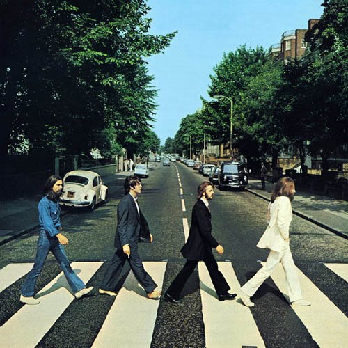
I was honored to provide the cover illustration for the Phinney Neighborhood Association's relaunch of their quarterly newspaper which is now known as, The Review.
Included here is the actual drawing which I then added color to with Photoshop.
And I am also including here what the illustration and story make reference to, The Beatle's landmark album, and a significant piece of pop culture, "Abbey Road." The PNA story is about a growing trend to find ways for older home owners to stay in their homes as they grow older through the help of a community network.
Sunday, March 27, 2011

Sketch: Smith Tower, 27 March 2011

Here's another peek at my sketchbook. This is a special treat from me to you. Enjoy it wisely.
Thursday, March 24, 2011
Sketch: Smith Tower

Here is a quick sketch of Smith Tower. I will provide you with some more sketches as I go. At the moment, I am playing around with ideas from a recent visit to Smith Tower. So, you'll see more related stuff. You also have the photos down below. I hope to visit Tat's Deli again really soon. I don't really think to label myself as an "urban sketcher" but that is something I do a lot. Very natural thing to do.
Monday, March 21, 2011
Seattle: Rem Koolhaas and Henry Moore

Two Great Talents that go together: Henry Moore's Vertebrae sculpture and the Rem Koolhaas Seattle Public Library.


Saturday, March 12, 2011
Sketch: On the Bus, 11 March 2011

On the #5 up Fremont. Nice, typical little piece. I've been in Seattle since 1993 and love to capture little moments in my sketchbook. Urban sketching, in particular, is a tradition with all kinds of artists, from painters to filmmakers to writers.
As I say, from time to time, if you're interested in any art, whether a painting or sketch, just drop me a line and we'll arrange something. You can always look me up or just reach me at inkwellspring at yahoo dot com.
Study for Painting: Out the Window

I'm working on a number of series, all different type of stuff. This one will be interesting for sure. Thought I'd share a little study piece. I will have some work up soon for a new show. I'll keep you posted.
Friday, February 18, 2011
Dog of the Week, 13 Feb 2011

Here is a handsome pooch, in Seattle, waiting for his owner. I love to go out and do urban sketches. I promise to share more with you.
Subscribe to:
Posts (Atom)